
“Pattern Drenching” Isn’t a Trend. It’s Just Good Design.
“Pattern Drenching” Isn’t a Trend. It’s Just Good Design.
Every few months, a buzzy phrase barrels through the design world, accompanied by breathless headlines like “The Bold Trend Designers Can’t Get Enough Of.” Lately, that phrase is pattern drenching—a term so over-the-top you’d think it referred to furniture being hosed down with florals.
What’s being hailed as “fearless” and “transformative” in magazines is, in reality, something seasoned designers have been doing for decades: layering pattern with fluency, confidence, and intention. As designer Melissa Colgan explains, “Pops of pattern, like pops of color, are much less restful than a room that has fully committed to being drenched in pattern.” In other words: going all in can actually soothe rather than overwhelm—if it’s done well.
What Actually Is Pattern Drenching?
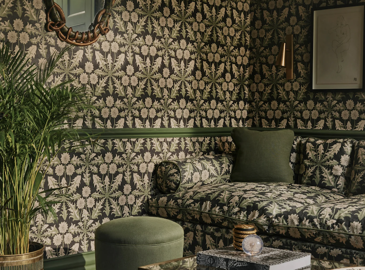
By today’s editorial standards, pattern drenching refers to applying print across every surface—walls, upholstery, window treatments, even ceilings—often in matching or coordinated motifs. At its best, it’s immersive, vibrant, and transportive. At its worst, it’s a visual migraine with a toile motif.
Magazines position this as maximalism’s next act. But let’s be honest: this approach predates hashtags. From French salons wrapped in toile de Jouy to Victorian parlors layered in floral brocade, design history is full of rooms where pattern wasn’t just decorative—it was architectural. The difference? Those rooms weren’t performing trendiness. They were pursuing completeness.
Because in design, joy requires structure. It’s not about surrendering to chaos—it’s about composing a room where pattern serves mood, memory, and meaning.
Why the “Trend” Framing Misses the Point
Calling pattern drenching a trend makes it sound like a gimmick: something splashy, fleeting, maybe even reckless. But that’s a disservice to what’s actually happening in well-executed spaces. When layered with purpose, pattern isn’t risky. It’s architectural. Emotional. Spatial.
As Ken Fulk put it, “Fearlessness of layering a pattern across walls, ceilings, canopy beds, and drapery conjures some of the biggest names in design history.” These rooms aren’t “brave.” They’re masterful—and mastery requires more than boldness. It takes understanding of scale, color theory, texture, and restraint.
At More Wow, we don’t “drench” as a directive. We compose. Whether that means creating a secret room where furniture disappears into the wallpaper or using a single block-print textile to anchor a space, it’s always rooted in something deeper than trend: the client’s story.
How to Use Pattern Like a Designer
Here’s how we approach pattern—not as decoration, but as a design tool.
Start with the Goal in Mind:
How you use pattern and what patterns you use, should stem from the client--their history and identity, how they want to feel in the space and what they want express.
Know Where You Are
Pattern can elongate, compress, or highlight depending on how it’s placed. Vertical stripes lift ceilings. Dense repeats warm up cavernous rooms. An immersive surprise can be great in some rooms (mudrooms, powder-rooms), but no bueno in a great room or foyer.
Color (not pattern) First
Unless you've found a MUST HAVE pattern that can't be denied, we always recommend starting with an overall color palette and mood for a room. Whether the room becomes entirely immersed in pattern or not, a unified palette can pull patterns into conversation with the overall room. They also can help guide you as you go pattern-hunting.
Ground Your Pattern
Pick a preliminary element in your room to ground your pattern. This could be drapery, a piece of furniture, a wallcovering or rug. Picking where to start, helps you consider each next piece in a step-by-step process that allows you to go deeper or pull back with confidence.
Build Your Confidence With 2 (before 3)!
Placing patterns in two places in a room is a safe place to start when you're not sure of yourself- Patterned pillows and drapery against solid colored sofa is fairly risk free choice, for instance. Add a 3rd and go from there to test the waters.
Layer, Don’t Overwhelm
Patterns pop with contrast, but remember a contrast to a large, multi-colored pattern doesn't need to be a flat solid color. Consider all of the material elements you have to work with--smooth/shiny v. organic and matte textures, large v. small patterns, solid v. multi colors. Each of these can be balanced to create an environment that is balanced with pattern without feeling overwhelming or tasteless.
The More Wow Perspective
We’re not anti-pattern drenching. We’re just anti-hype. The idea that this is some radical new aesthetic frontier? That’s marketing spin. Pattern has always been a tool for the emotionally attuned, historically informed, compositionally confident designer.
Call it what you want. We just call it design done well.
So next time someone breathlessly tells you they’re “drenching” their dining room, smile. They’re not chasing a trend. They’re discovering the joy of pattern. And—hopefully—doing a little good design along the way.